Six Centuries of Danish Royal Monograms — and Branding
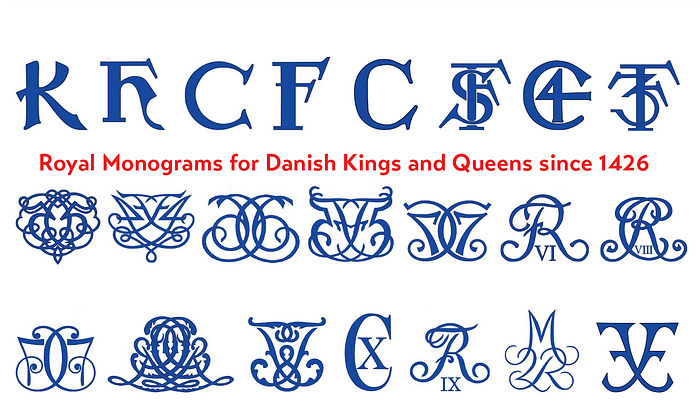
Danish monarchs — much like their European counterparts — have used royal monograms for centuries. It’s always been important to establish a strong brand identity — whether you’re a start-up company or a king. In this article I explore the design evolution of the royal monograms of the Danish kings and queens since around 1448.
These royal monograms — also known as royal cyphers — are essentially logos for kings and queens and were used during their lifetime on documents, currency, royal bling like scepters and crowns but also on buildings they had constructed for them. When they passed away, the monograms — certainly on buildings — remained as legacy logos.
Denmark has the second oldest monarchy in the world, after Japan. The first king of Denmark mentioned in European sources was Hugleik, in 515 CE, and there were other kings after him but the current royal bloodline dates to Gorm the Old (936–958/64). Denmark is also a country with a deeply-rooted design culture. My kids had design at school in the third grade, learning the three principles of Danish Design: functional, practical and elegant.
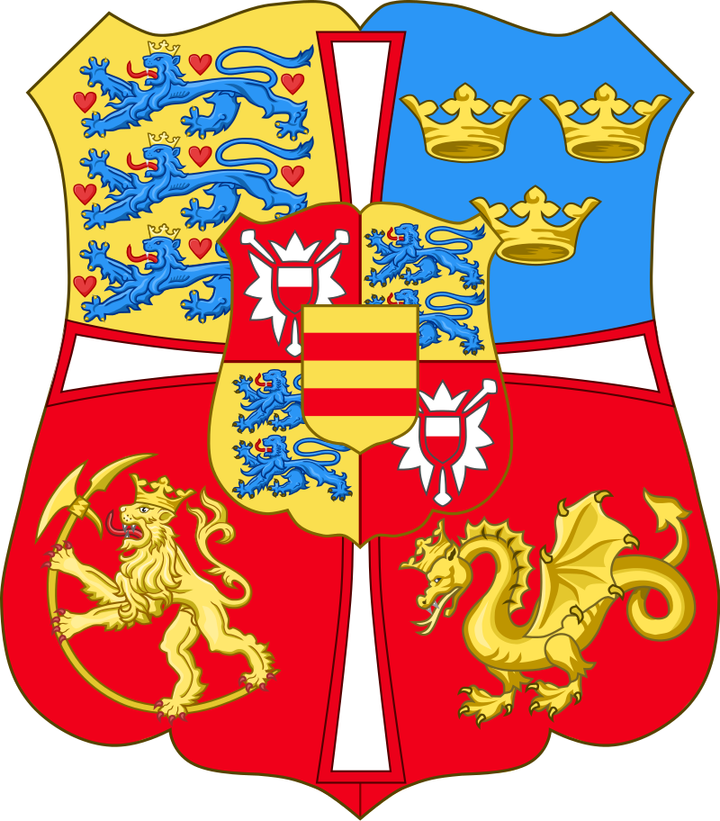
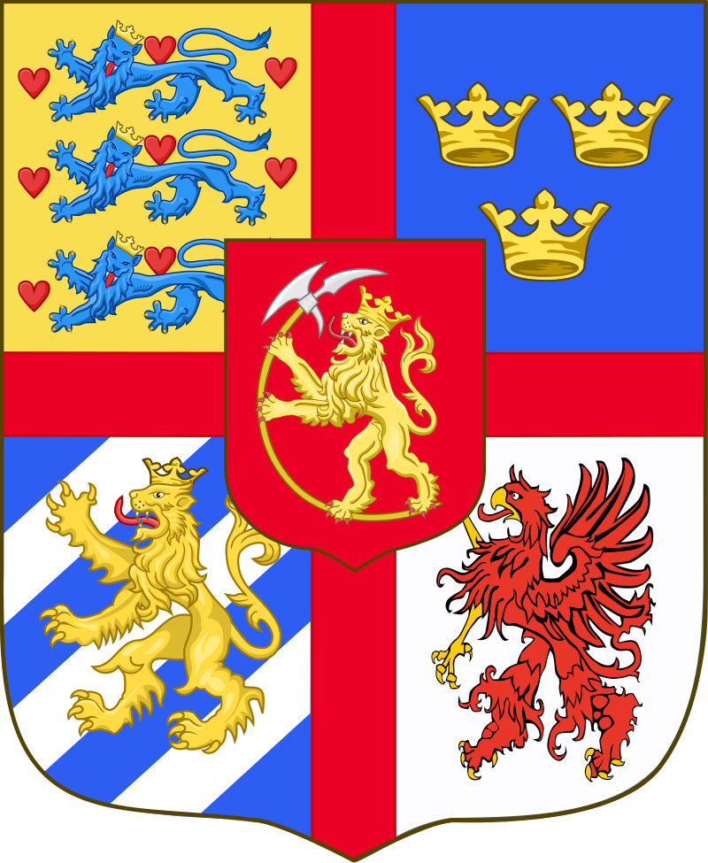
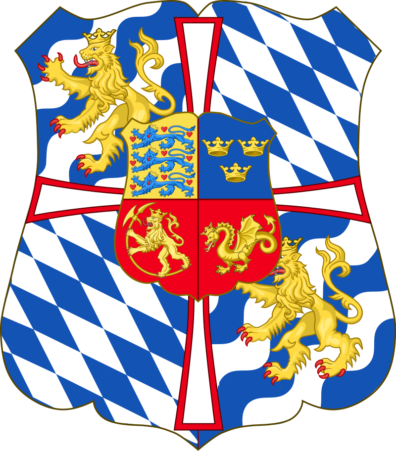
This design tradition obviously developed over time. Take one look at those three coats of arms from way back in the day and it hurts your eyes.
There has been all manner of visual branding for royals since forever. For a long time there was complete design overkill. With a modern design eye, much of it looks pompous and completely over the top and it was designed to daze and amaze.
Yes, there is way too much happening in those coats of arms from a design perspective but there was a lot of brand confusion back then. Christian I wasn’t just King of Denmark. The dude was Christian I: By the Grace of God, King of Denmark, Sweden and Norway, the Wends and the Goths, Duke of Schleswig, Holstein, Stormarn and Dithmarschen, Count of Oldenburg and Delmenhorst. That’s some crazy Game of Thrones stuff right there.
Imagine the design challenge of having a client who wants all of that incorporated in their visual identity.
Time to Simplify — Enter the Monogram
At some point in history, some royal in Europe decided to scale back and simplify with the creation of the royal monogram. Monograms have been in use since ancient Greece, as branding for wealthy rulers. It was first later that the royal monogram became a mainstay for European royals — and an integral part of their brand identity.
I don’t know who the first European royal was to develop a monogram. In the UK, it started in the Tudor period, from around 1489. I noticed, however, that Danish kings might just have been first movers, since royal monograms have been used since at least 1448.

By all accounts, it was Christian I who started the monogram ball rolling back in 1448. At left, above, is the full monogram with the crown on top. All the monograms feature the crown but I cropped them out for design clarity.
In January 1448, King Christopher of Denmark, Sweden and Norway died suddenly and without natural heirs. The vacant Danish throne was offered to Duke Adolphus of Schleswig but he declined and suggested his nephew take the gig. Christian I became king.
Back in the day, the name Christian was spelled with a K — Kristian. Christian I clearly wanted simplicity and he was also thinking about legacy. He founded the House of Oldenburg which is still the House that Danish royals are a member of. He founded the University of Copenhagen, too.
He was the first of this line so he could do whatever he wanted and he decided to go minimal. The next king was Hans (John in English). He followed Christian I’s design theme and used a simple H. From then on, a style was cemented. Hans’ second son became the next king — Christian II.
From that point on, all Danish kings were to be called Christian or Frederik which, for the purpose of this logo/monogram analysis, makes it easier to see a design comparison through the centuries.
Christian II and his sucessor Christian II just went with the basic C, without their designated number, which was either cheeky or a product of the uncertainty of keeping royal lines going. The only difference between their monograms is the way they tilted the serif flare on the C. In between them, the first Frederik showed up and he kept true to the design guide with a simple, solid F.

Frederik II was the first to implement his number in the growing line of kings, adding an S for Second snaking around his F. Maybe Frederik III was more inspired by his grandfather than his dad, in the way he copy-pasted the F and added the number three. I don’t delve into dramas in other families, so who knows.
Then we get to Christian IV. This guy was one of the most prolific Danish kings in history. He put Denmark firmly on the map as a European power. Back in the day, a king was also a real estate developer. As a result you royal monograms on many buildings but Christian IV is the most prominent monogram in Copenhagen because he built so many buildings. This is one of my favourite monograms in the long line. Simple and effective. Using the number 4, instead of the roman numeral IX. It’s wonderfully simple in its design. It could easily be a logo for a modern company or a boy band.

After Christian IV hammered out a bold, strong and timeless logo, Frederik III stuck dutifully to the program but then things got weird.
I guess Christian V was a little more flamboyant and probably influenced by the Baroque period vibe all around him, with highly ornate embellishments on basically everything. He departed from the simplicity and went all squiggly and giggly on us.
If you look at the row of monograms, above, he influenced his predecessors with this cursive trend for quite a while, even though the Baroque period ended around 1750. Although Christian V remains the most flamboyant — things remained squiggly but the following kings kept things toned down a bit. When we get to Frederik VI, we can see he stuck with cursive but it is starting to return to something more simple.
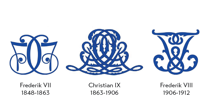
Although maybe not. These three monograms over a period of sixty years or so are all over the map. In particular, Christian IX went ballistic with his noisy, confusing monogram. He grew up in a time featuring the Danish Golden Age and a blizzard of art movements like Romanticism, Realism, Impressionism and Decadent. Fair enough if he got all confused about which one to be influenced by.
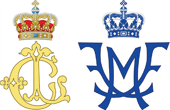
Although before he went ballistic — and before he became king — he had a monogram for him and his wife, crown princess Louise. I couldn’t find many examples — although I didn’t look that hard — of spouse monograms in Danish royalty. The one above, at right, is the monogram of crown prince Frederik and his wife Mary. As you’ll see farther down, Mary gets bounced from the monogram when Frederik becomes king on 14 January, 2024.
But let’s get back into the flow.
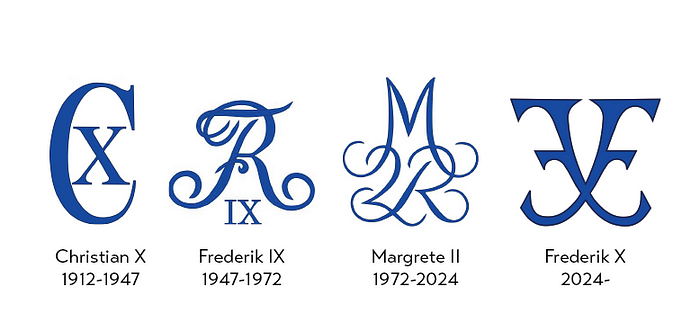
Ahhh. Look at that! Here we go. Back to the roots! It appeared that Christian X looked over his shoulder and shuddered at all the monogram designs over the previous two and a half centuries. Then he looked past them and sighed deeply and contentedly when he realised there was design hope — and tradition — to be found with his distant relatives. He went back to the basics of Danish Design.
He summed up his entire, longwinded title: “Christian X: By the Grace of God, King of Denmark, Iceland, the Wends and the Goths, Duke of Schleswig, Holstein, Stormarn, Dithmarschen, Lauenburg and Oldenburg” — with a simple C and an X — although he did have it made all tall and skinny for the first time.
Perhaps he was also influenced by the artistic movements of the age. He become king in the midst of the modernist movement, where clean lines, functional design and a minimal approach were prevalent. He did keep the the letters serif even thought sans-serif typefaces were becoming popular. Although it wouldn’t be far fetched to assume that he stuck to the simple serif C’s of Christian II, III and IV in order to maintain a design tradition.
But…. then Frederik IX killed the revival of the old school style dead, however, with his return to cursive.
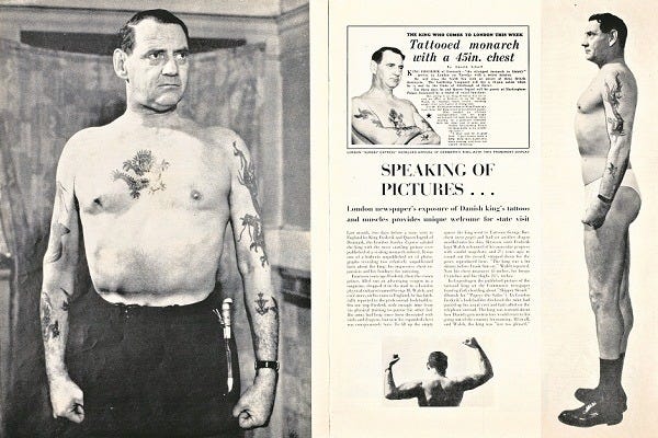
Although if you look at that fancy R merged with the F, it might look like a tattoo you would get in some faraway port. And Frederik IX was famous for his ink. Not many royals who would proudly show off their tattoos like he did, in the photos above.
Frederik IX and Queen Ingrid had three daughters and no sons so the Danish government changed the hereditary succession rules to allow for female monarchs back in 1953. Which also meant that after over 450 years of monograms based on a C or an F, along came Queen Margrethe II in 1972.
She had the design luxury of having to bother with those two letters so her monogram is a freestyle combination of M, 2 and R (regent). Margrethe I was queen between 1387–1412 — before the monogram age so there was no reference to follow or depart from. Nevertheless, it is also rather minimal in its cursive design.
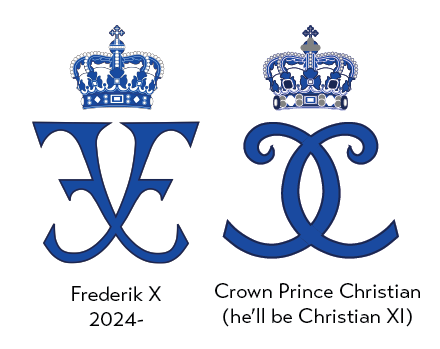
Which brings us to Frederik who will become king on 14 January, 2024 after his mom Margrethe II surprised the entire Danish nation by announcing her abdication during her new year’s speech to the Danish people. The last time a Danish sovereign voluntarily gave up the throne before death was over 900 years ago. King Erik the 3rd Lam abdicated in 1146, in order to enter a monastery.
Check out the monogram that will feature during Frederik X’s reign. It is unique compared to all the other F monograms through history. It is a return to a simple design and graphically, it is one of the more clever monograms. There are two Fs but it isn’t confusing to figure out that the F is the dominant letter. And the double F is rendered as an X at the same time. It is a kind of hybrid between the squiggly, cursive monograms and the simple bold lettering of others.
To the right in the above graphic is the monogram for Frederik X’s son, who will become Christian XI someday. His monogram is clearly influenced by his Dad and, when looking at it, I thought he was going to be Christian X for a moment because the Cs look like they’re forming an X, but I suppose he was going for an abstract 11 because it doesn’t look like XI, but hey. Kids today, jeez.
After all this, it looks like it has always been easier to design something cool with the letter C than the pesky letter F. Although after staring at these monograms for so long, I hope I never have to do any design job featuring either of these letters for a long time.
