The Arrogance of Space
I coined the phrase Arrogance of Space back in 2012 to describe more concisely and vividly the havoc wreaked by car-centric planning all over the world.
You can see a film about The Arrogance of Space on the Life-Sized City YouTube channel right here.
We have a tendency to give cities human character traits when we describe them. It’s a friendly city. A dynamic city. A boring city. Perhaps then a city can be arrogant. Arrogant, for example, with it’s distribution of space.
In my work as an urban designer in over 100 cities around the world, I’ve become quite obsessed with the obscenely unbalanced distribution of space that I see everywhere I go. The nauseating arrogance of obscenely wide car lanes and the vehicles sailing back and forth in them like inebriated hippopotamuses.
Calgary, Canada
Back in 2013, I was in Calgary, Canada for five days and from my balcony at the hotel, I watched the traffic below on 12th Ave. A one-way street that was never really busy at all.
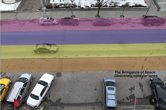
From above, the arrogance of space was very apparent. Even more so when I was in a vehicle driving down the lanes. The photo, above, shows the car lanes divided up with their actual width. Watching for five days — okay, not 24/7 … I have a life after all — I didn’t see any vehicles that filled out the whole lane with their girth. So I decided to take a bit of each lane away.


By narrowing the lanes slightly, space was created. Obviously. Duh. And there was still ample space for the vehicles — including the big trucks and the oh so arrogant citizens of SUV Nation.
We know that narrowing lane width improves safety. Just like tree-lined streets — or streets with utility poles, etc — make drivers slow down and concentrate, narrower travel lanes have the same positive effect. There were posters all around Calgary with the catchy headline Crotches Kill — a campaign to vainly try to get people to stop using their smartphones, often placed in their lap as they drive. I can understand why texting is perceived as effortless when motorists are given so much space.
So, narrowing lane widths is safer. But what to do with that extra space? All eyes on the graphic at right, above. Just by chipping away at the car lanes, I found space for a Best Practice cycle track. On the right, of course. Only a moron would put it on the left side of a one-way street — unless it’s a contraflow cycle track.
Addendum: It’s not possible to see it on the above photos but the car parking at the bottom is an indentation in the curb in front of the hotel, so the cycle track runs along the curb, as it should.


On so many streets I’ve looked at in North American cities, even a two-lane street can cough up enough space for a Copenhagen-style cycle track.
I tire of hearing the incessant “we don’t have space for bicycles” whine, especially in the Americas. The space is right there if you want it to be there. Removing car lanes to create cycle tracks is doable and so many cities around the world are doing it: not making cycle tracks for those who cycle now, but for the many who could be cycling if it was made safe.
However, when you live in an arrogant city, space is readily available. Often not even involving removing lanes or parking. It’s right there. If you want it. Like in the two photos, above, again from Calgary. This time, Memorial Drive. If you look close, you’ll see a cyclist along the curb — on a street with a speed limit of 60 km/h. With no physical separation. Insane. But the space is there.


Above is another example, this time from Montreal.
But hey. I can hear the traffic engineers complaining already. This, of course, messes with every mathematical model they have — most of them dating from the 1950s or 1960s, like this one. It’s not, however, about them anymore. They’ve had their century of trial and error — mostly error. We’re moving on now. We’ll redesign our cities and tell them what to do and how to help us — based on human observation, rationality and logic. They’re brilliant problem solvers. We’ll just be telling them what problems to solve from now on.
This quote by Andres Duany is appropriate:
“The problem with planning is that it has been overtaken by mathematical models — traffic, density, impact assessment, public costs etc. discarding common sense and empirical observation.”
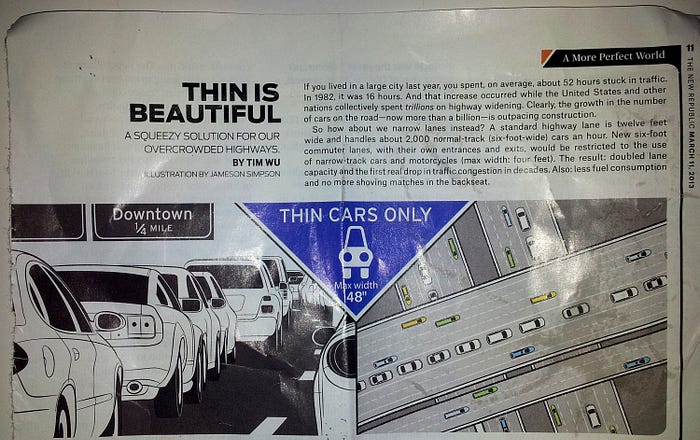
I was reading a copy of The New Republic I found in an airport — and saw the above snippet. The writer, one Tim Wu, clearly has time to ponder when he’s sitting in traffic. He noticed the wide car lanes as well. His solution, however, was to promote narrower cars and increase the number of lanes — thereby creating “the first real drop in traffic congestion in decades”, he claims. Note the tagline at the top right: “A more perfect world”. This company is even producing narrower cars and their website makes the same claim: “This doubling of lane capacity can solve traffic congestion.
Unfortunately, the myth persists. The sum of our knowledge after 100 years of traffic engineering is that if you create more space for cars, more cars will come. Induced Demand. Period. Again, time to move on. A more perfect world is within our reach, once we get a flock of misconception monkeys off our backs.
Paris
Yeah, so, there I was on summer holidays with the kids, standing atop the Eiffel Tower in Paris. Been there, done that many times before, but it’s always a beautiful experience looking out over a beautiful city. If you’re afraid of heights, the rule of thumb is “don’t look down”. When you work with urban design, life-sized cities and urbanism… it would seem that this rule applies as well. Do. Not. Look. Down.


I did, however. I looked down at the intersection on Quai Branly where it meets Pont d’Iéna over the Seine and took a photo. This is a place with easily hundreds of thousands of visitors every year and more and more cyclists. It is also clearly a place dominated by The Arrogance of Space and last century traffic engineering. It’s a museum for failed, car-centric traffic planning — sad and amusing all at once.
I did a simple thing when I got back to my office in Copenhagen. I squared off the photo with (very roughly) 1m2 quadrants. It’s not totally exact and it doesn’t really matter. Creating this grid, I gave the urban space colours based on who it is intended for. It’s pretty self-explanatory above.
Worth noting, however, that while I reluctantly gave the goofy bike boxes the “space for bikes” colour, I refused adamantly to do so for the sharrows in the intersection. They are ridiculous and should never, ever, be classified as bicycle infrastructure.
With the colours you soon see how much space is allocated for motorised transport. Arrogantly so.


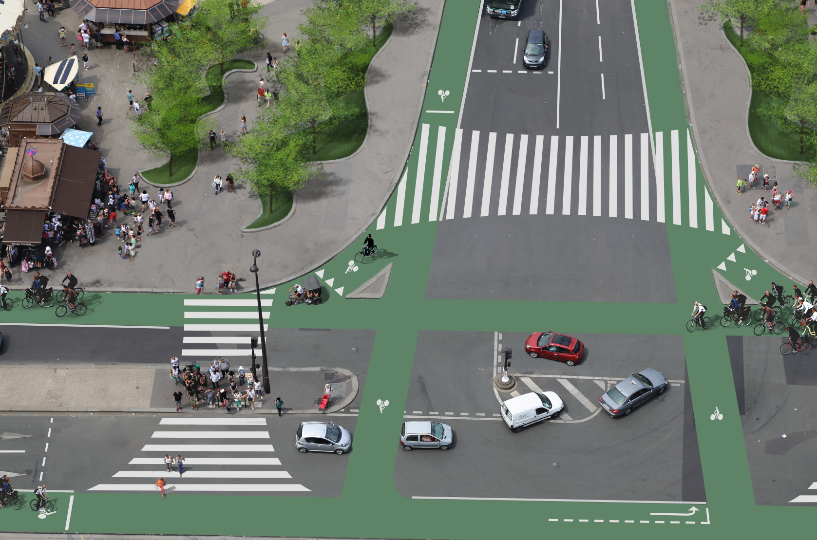
I then started working with the grid graphic. At left is the number of humans using the different spaces. Only twenty-three of them are sailing around the ocean of red. Thirty-eight pedestrians are clustered together on pedestrian islands waiting for the traffic engineering gods to grant them permission to cross. In the middle graphic you can see the actual space taken up by the motorised vehicles (dark red) and bicycles (dark purple). There were only two bicycle users and a pedicab with two passengers in the intersection at this moment. Yes, cars take up a lot of space, but man… look how much space they don’t even occupy. Space that could easily be reallocated to a few hundred thousand pedestrians and many bicycle users.
The great thing is that with the right planner and the right political will, the solution is simple. That’s it up there, on the right. Took me 20 minutes with a pencil and a few hours in photoshop. I also freestyled the pedestrian crossing, fanning the white stripes out to accommodate the desire lines of pedestrians. De rien, Paris.
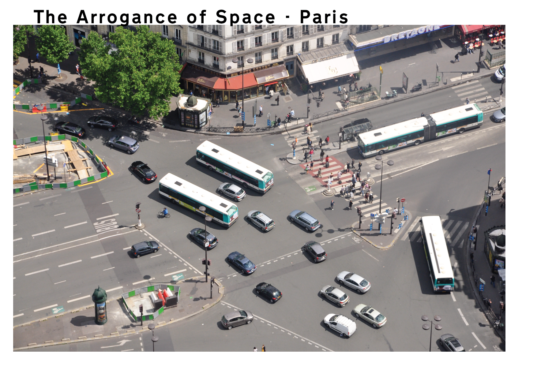


A bit farther to the south in Paris, the same Arrogance of Space applies to this intersection below Montparnasse Tower — Boulevard du Montparnasse around Place du 18 Juin 1940.
Sao Paolo, Brazil
Here’s a photo taken in December 2015 of the intersection of Praça Julio Mesquita — Avenues São João & Rua Vitória — in Sao Paolo, Brazil. It was 16:40 on a Saturday. Looks nice and quiet without a lot of traffic of any sort. We are, however, looking at the space allocated to various transport forms.


The same patterns emerge here. An arrogant expanse of red. Everyone else… good luck with that.
Cape Town, South Africa
This photo was taken by a friend of mine flying into Cape Town. I can’t tell you the specifics of the location, but it’s obviously near the airport . That doesn’t stop me from slapping my Arrogance of Space filter onto the photo. It’s a bad-ass intersection — the kind that makes old-school traffic engineers feel all warm and fuzzy. It’s a monster of extreme arrogance.


Let’s face it… if you have space for street vendors to stroll down the car lanes (look at the top of the left photo), your lanes are stupid wide. Behold, once again, an ocean of car-centric red. Thin pedestrian crossings with fading paint. No bicycle infrastructure is present.

Another whistleblower revelation to illustrate how all that space isn’t even needed is marked right there on the asphalt. The tire tracks of the vehicles spell it out. I coloured them red, at right, to highlight it.
Moscow, Russia
There’s a Russian proverb I learned when working in that country. “There are only two problems in Russia: fools and roads”. In the case of the modern Moscow and, indeed, most Russian cities, it’s quite obvious that the fools are also planning the roads.


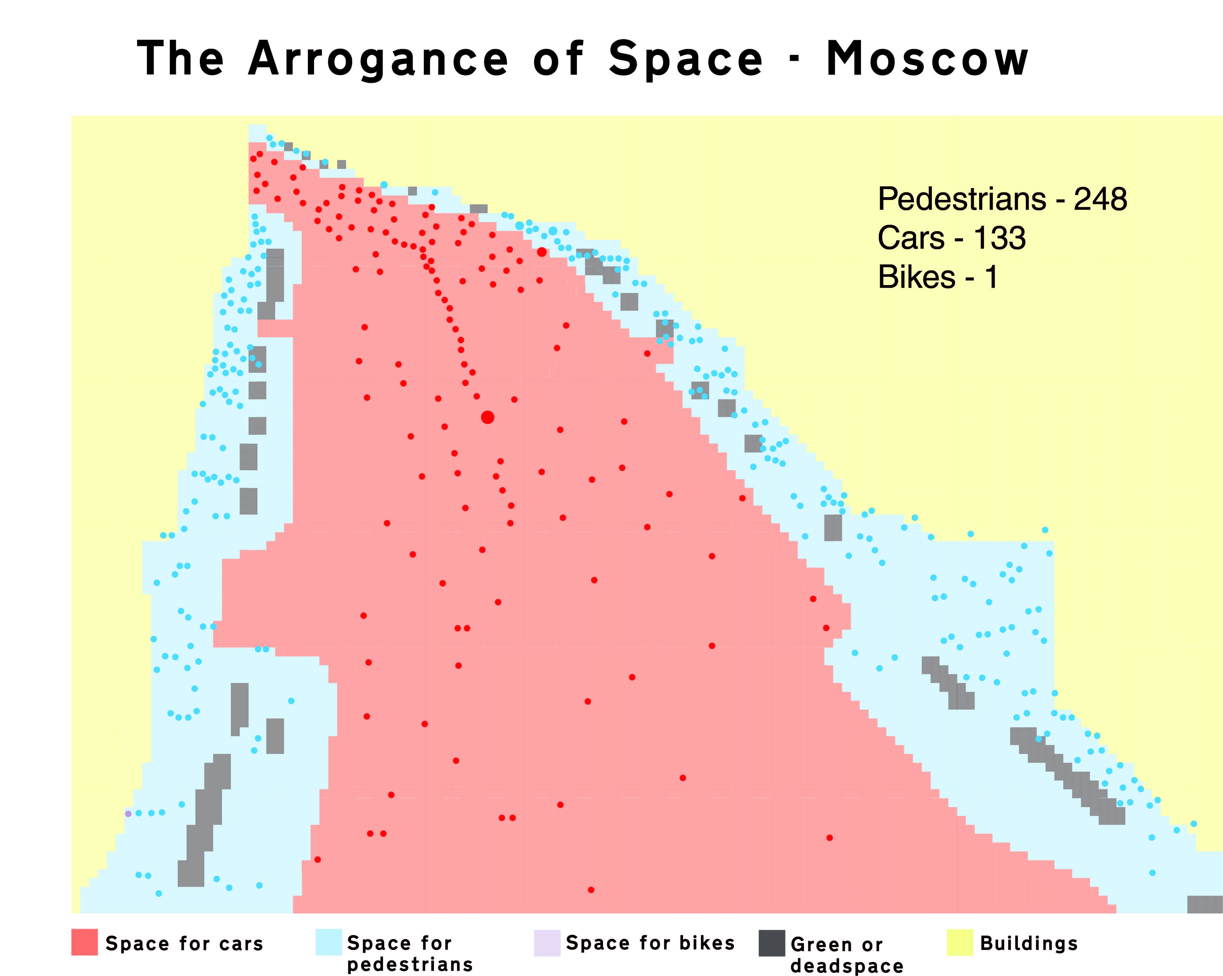
These graphs show that Moscow takes Arrogance of Space to a whole different level. I lived in the city in 1990, riding an old red bicycle around and only competing for streetspace with a handful of Ladas. Look at you now, Moscow.
Barcelona
I applied my Arrogance of Space tool to some random streets in a city where I spend a lot of time: Barcelona. The classic form of the city as laid out by Ildefons Cerdà back in in the late 1800s is legendary. Cerdà planned for humans and sustainable transport but it is clear that the past few generations of Barcelonan politicians have put their money on the automobile.

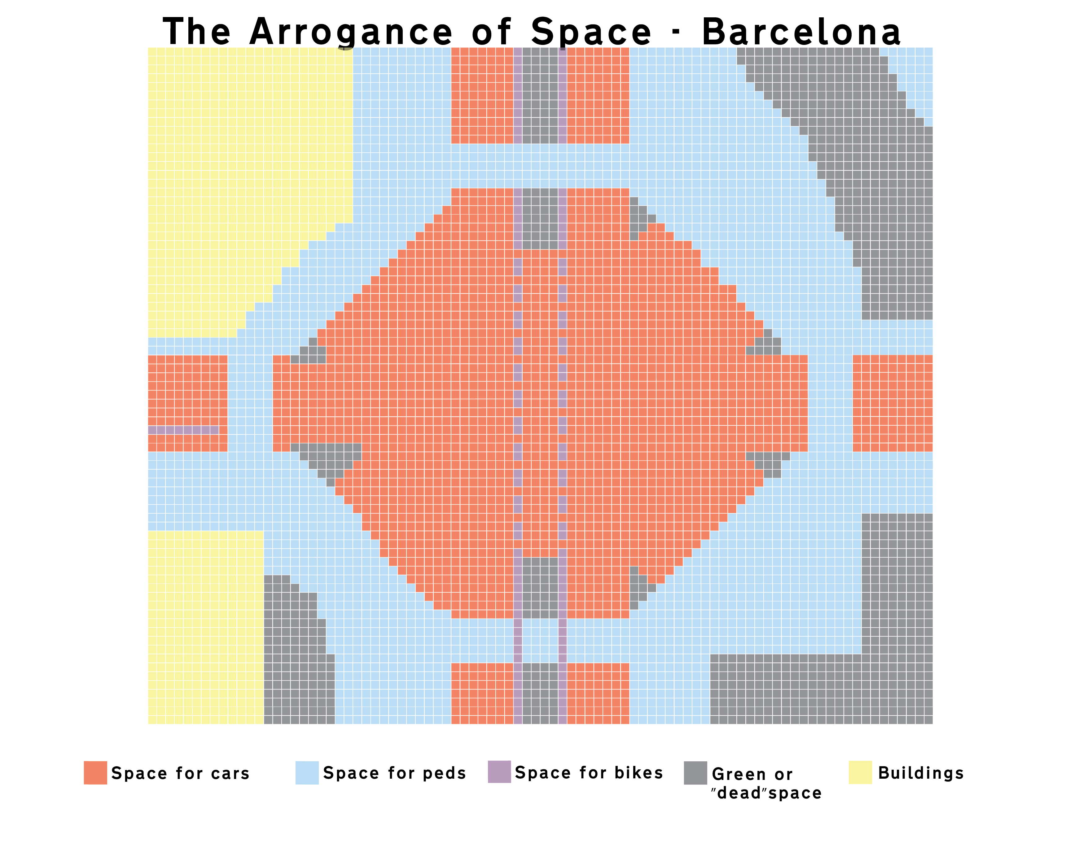

Here is a classic boulevard intersection on Carrer de la Marina. These intersections have been repurposed as massive parking lots and high-speed thoroughfares. Cerdà certainly didn’t intend for this development to trash his vision. Others have done it for him. At the right, however, is an easy fix for these intersections. Reducing the number of cars lanes as well as their width, giving back public space to the people and designing intelligent bicycle infrastructure based on Best Practice.


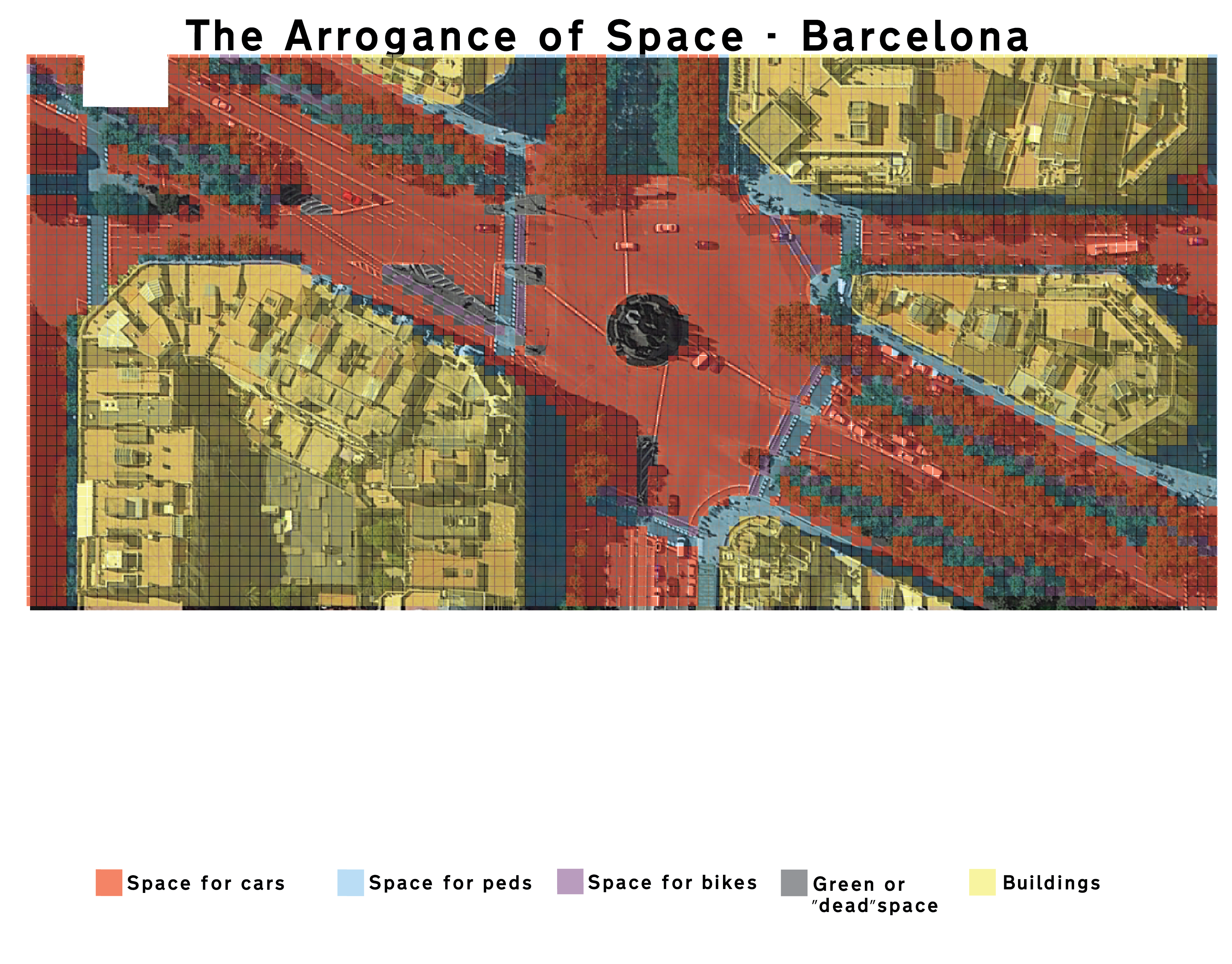
Here’s a randomly selected intersection on Avenida Diagnol. Cerdà would roll in his grave if he saw what had happened here. It’s time to go back to the future with some New Cerdáism.
Copenhagen
Oooh. CopenHAGEN. Urban darling of the world. Sixty-two percent of residents in the city ride a bicycle daily to work or education in the city. Twenty-one percent take public transport, be it bus, metro or train. Only nine percent drive a car — even though car ownership is around twenty-five percent. Basically, NINETY-ONE PERCENT of our citizens DON’T drive a car in the city — here in one of the richest countries in the world. All good, right?

You would think so, but even Copenhagen suffers from a serious case of Arrogance of Space. I took a section of Hans Christian Andersen Boulevard — the 1950s urban planning travesty that carves the Danish capital in two — and did a quick analysis.
It’s the busiest street in the Kingdom with between 50,000–60,000 cars a day roaring past, most of them firmly in the “parasite” category. These are not people who live in the municipality and who therefore do not pay for the road space that we provide them. There has been talk for years of burying this street and reclaiming the space it occupies. While not a bad idea — albeit an expensive one — it wouldn’t remove the cars from the city, since they would pop up out of the tunnel at some point.
As you can see on the graph, above, a whopping sixty-four percent of the transport space in Copenhagen is allocated to cars — both car lanes and curb parking. This is most apparent at the location we are looking at here.
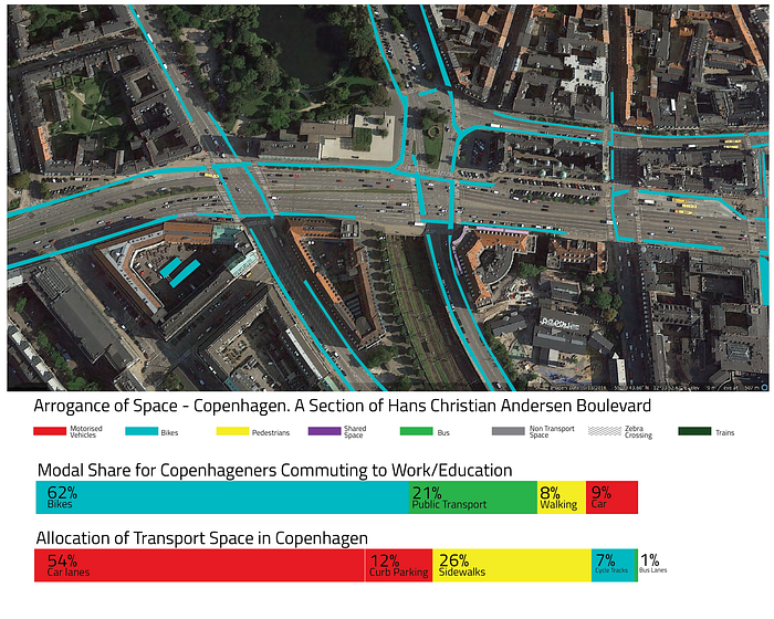
When I map out the space allocated for cyclists, it looks like this. There are over 25,000 cyclists along the boulevard on weekdays. Add to that around 10,000 who cross the boulevard from the side streets. Certainly not one of the busiest bicycle streets in Copenhagen but the numbers are respectable. On the map you can see how the infrastructure is part of a cohesive network.

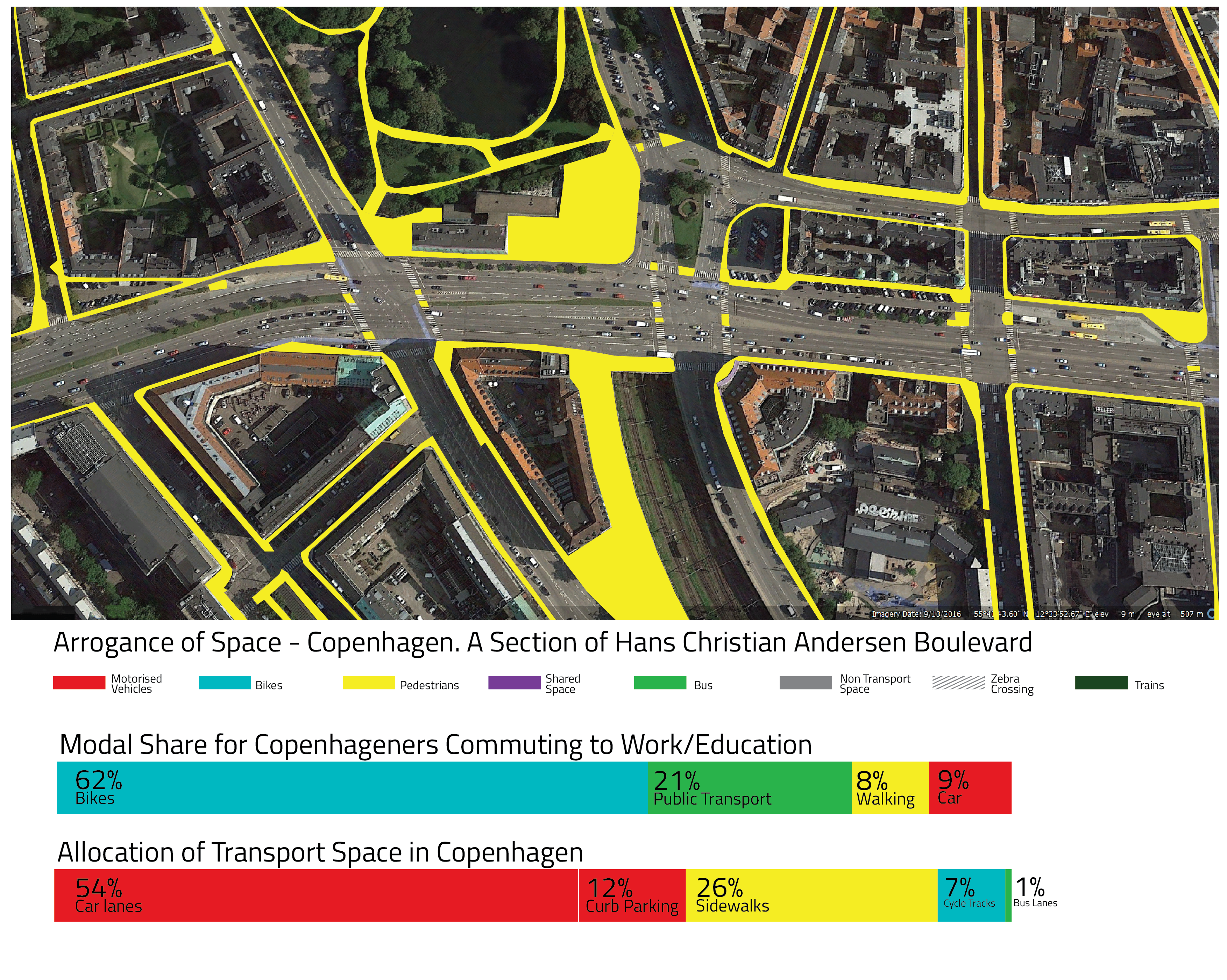
Here are the maps for the space occupied by bus lanes or trains, at left, and the space allocated to pedestrians, including squares. The trains are not relevant for this exercise, as they disappear underground, but buses are a key transport form on this corridor. 360 of them roll past between 7 AM and 7 PM. With an average capacity of 50 passengers, that would add 18,000 people moving back and forth along this stretch. And yet there is a severe lack of dedicated space for them.
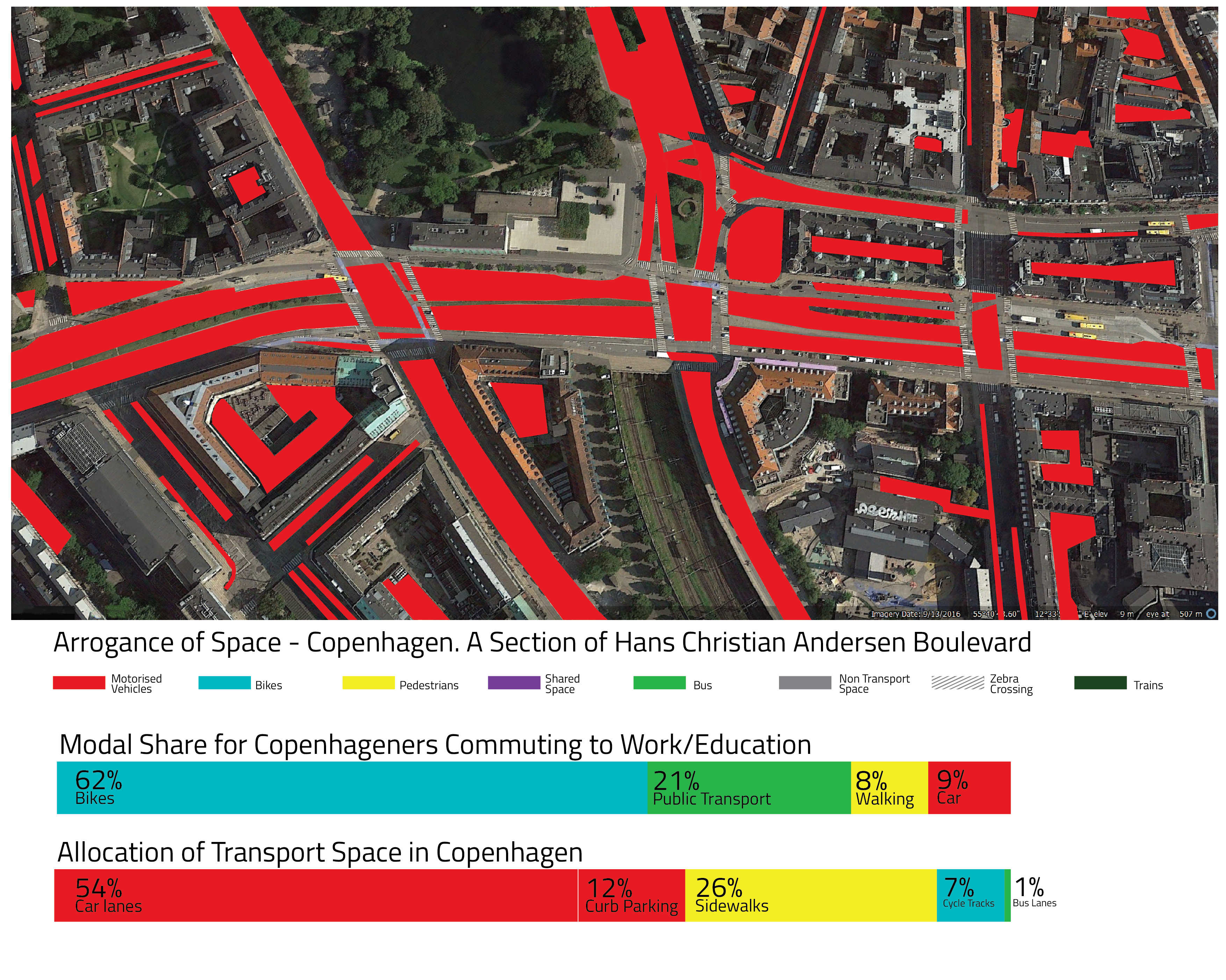

Here’s the rub. The amount of urban space given over to motorised vehicles. Most of it handed free to motorists who do not pay taxes in this municipality. Motorists, it is worth mentioning, already have it easy in Denmark. It’s cheaper to buy a car today than during the oil crises in the 1970s and the same applies to gas, rendering the high tax on cars here rather irrelevant. In addition, a resident’s parking permit only costs around 750 DKK (€100) per year — despite the fact that a parking spot costs the city — and the taxpayers — around 50,000 DKK (€6,600) to implement and maintain.
Reversing the Arrogance of Space
Alright, alright. You get the point. Things are messed up and have been for a very long time.

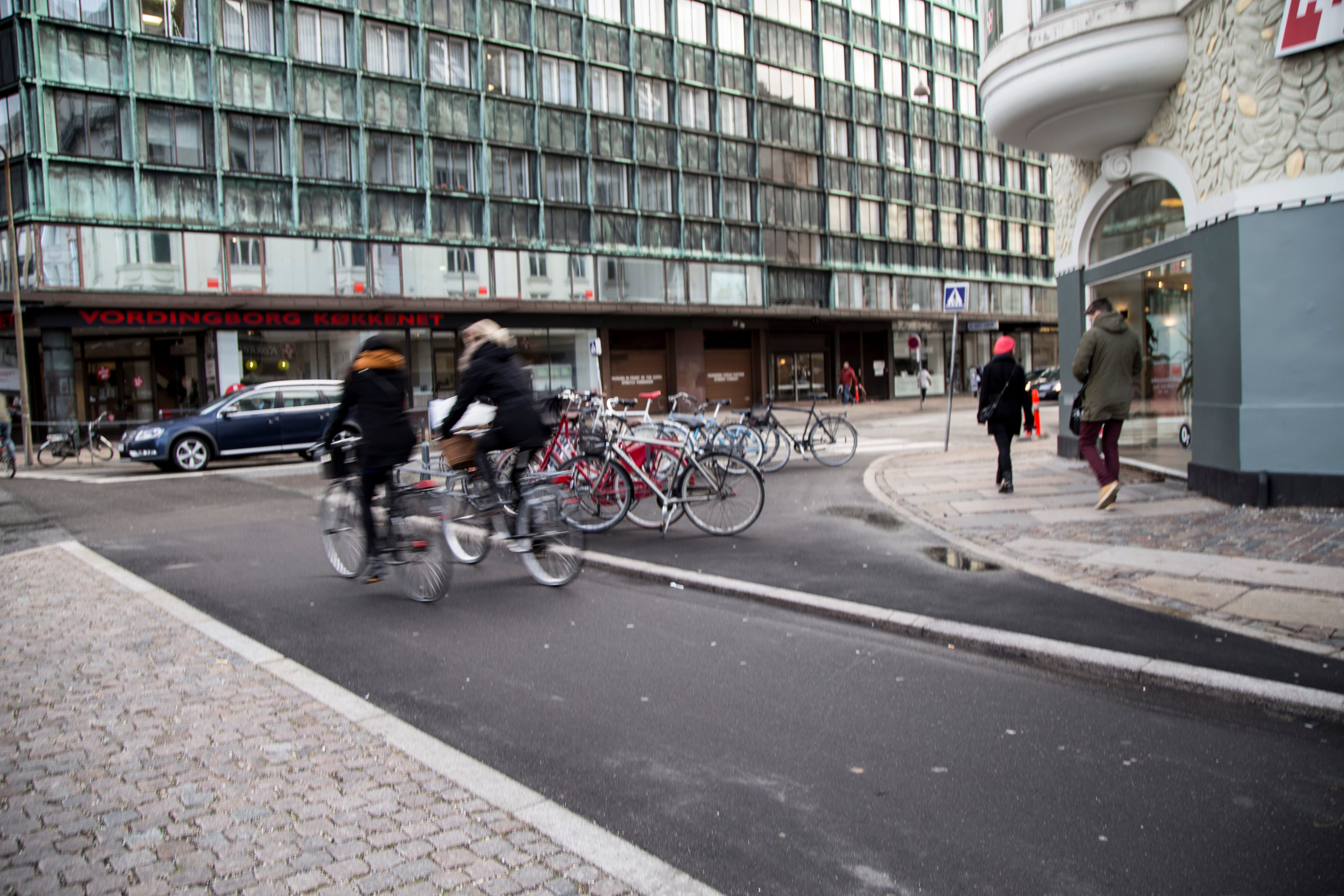
Sometimes hope doesn’t arrive standing triumphantly astride a bulldozer. Sometimes it comes in small doses. Like this corner in Copenhagen. In many cities, curved corners were put into place to allow cars to maintain their speed as they turned — like in the Paris photo from the Eiffel Tower, farther up. In other cities, like Copenhagen and Barcelona, the corners were often rounded to accommodate the turning radius of trams. Copenhagen had a splendid tram network from 1884 to 1972 — until the most destructive Lord Mayor in the history of the city (in an urban planning sense) — the ironically named Urban Hansen — ripped them out. When the car started to dominate, such corners were left alone. Until now.
As you can see in the photo on the left, there is a lot of unused space. Until the City marked off a ninety degree angle with curbstones and filled it in with asphalt, widening the sidewalk nicely and creating space for fifteen bike racks, providing an extra buffer against the car traffic. It took them fifty years to do it, but they did it.
In addition, at bottom left there is a build-out towards the traffic, narrowing the street further and creating another buffer. The cycle track was widened at the same time. Not as wide as in many spots in the city, but still enough for conversation cycling — two cyclists cycling and talking, with room for another cyclist to overtake.
In this article, you can see more examples of using street space for bike parking and, in the process, reversing the arrogance of space.
Tokyo
In another example of contrast, this is the view from my favourite hotel in Tokyo, overlooking the Shibuya crossing — which just may be the world’s busiest crosswalk. I don’t stay anywhere else when I’m in Tokyo simply because I love this view. I can stare at it all day long.


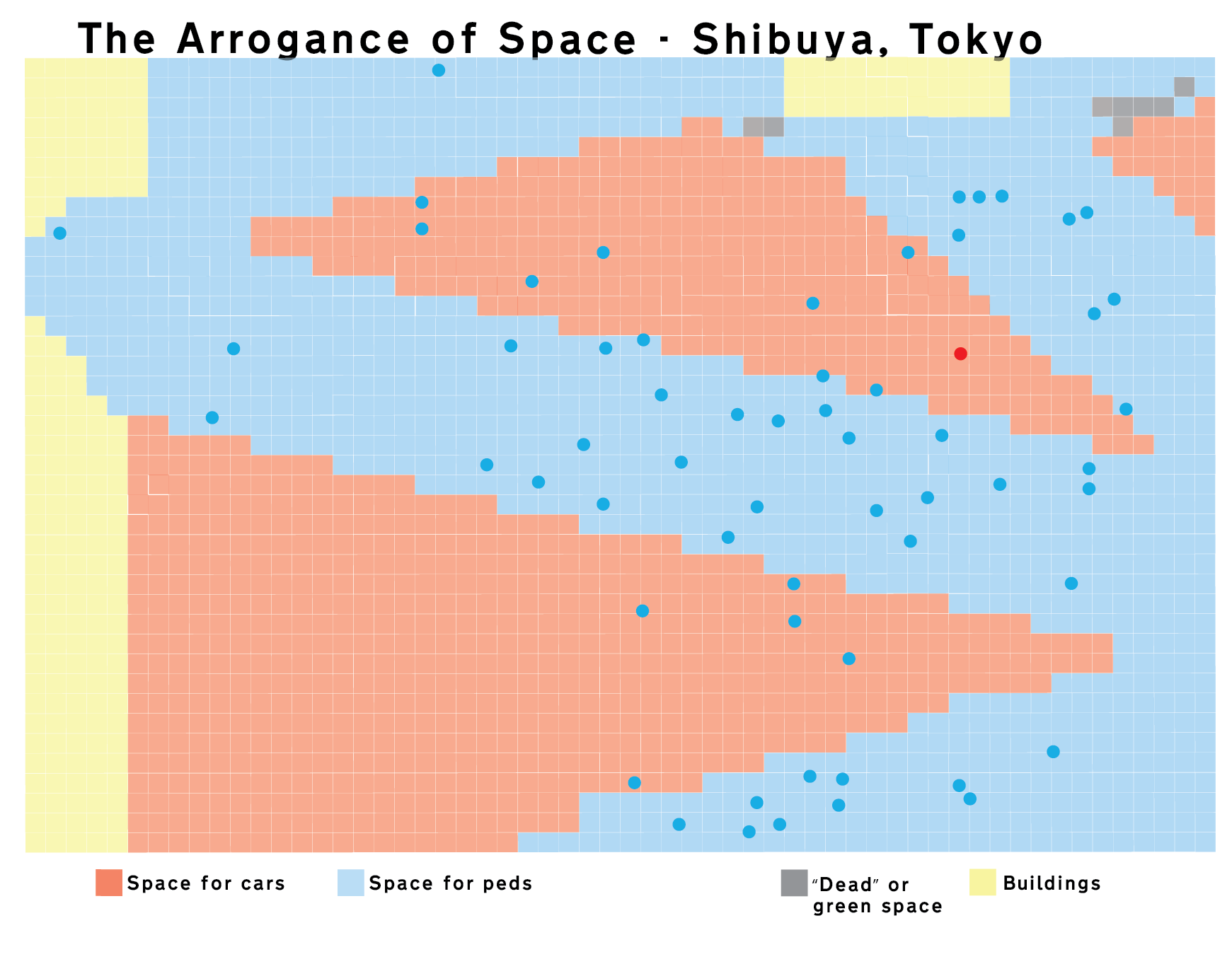
According to my EXIF info I took this photo on Friday, May 22, 2009 at around noon. Not so busy at this moment, but still great to see. Pedestrians here get their own signal in all directions, including diagonally. A fantastic pedestrian scramble.
Do it Yourself
Now you, too, can get on board the Arrogance of Space Mapping Express. A colleague of mine in Slovakia has just released this online tool: The Arrogance of Space Mapping Tool. Upload a photo from google maps and start adding the colours. Export. Add to internet. Use the hashtag #ArroganceofSpace.
Go crazy.
